Some time ago I redeemed the points from one of my credit cards and treated myself to a book. Not an ebook. An actual book that you can hold and touch. For sheer beauty it’s hard to beat Robert Bringhurst’s The Elements of Typographic Style. The eye glides over the creamy pages, the balanced blocks of text elegantly buttressed with marginalia. Bringhurst brings poetry to his subject. When he declares that “the heartwood [of typography] is calligraphy—the dance, on a tiny stage, of the living, speaking hand,” I get shivers.
Bringhurst writes lucidly on the history and aesthetics of typography, technical aspects such as kerning, and the mathematics underlying the design of fonts and pages. I haven’t digested the whole book. Even if I finally do, I won’t be an expert in typography. As with any art, mastery takes years of practice.
Years I don’t have.
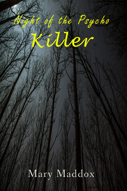 All the reading I’ve done about fonts stresses basic principles: Fonts communicate a message. They should reinforce the meaning of the words. They should be compatible with other fonts in the design. Take the fun book cover to your right. The fonts don’t exactly reinforce the atmosphere of menace, and the two calligraphic fonts together are a bit much.
I had some knowledge of and appreciation for fonts by the time I received four mockups of the interior of Daemon Seer, each with a distinctive page design and font combination. They were created by Morgana Galloway of the Editorial Department. The one that immediately caught my eye paired the workhorse Minion Pro for body text with Akura Popo for chapter titles and headers (or in this design footers). I love Akura. It’s bold, Gothic, and unusual, just like Daemon Seer.
 Morgana did a fantastic job on the print and ebook editions, both of which have chapter titles in Akura I checked out Akura online and discovered that its maker, TwicoLabs, offers it for free.
Yes, free!
It will come as no surprise to most readers that hundreds of fonts can be downloaded for free, and hundreds more purchased at a reasonable price. But when I began working with typography, it was a revelation to me. During a shopping binge at MyFonts, I found Crypton, a sanserif font with edges so sharp they look dangerous, for a fraction of its retail price. I had no immediate use for Crypton but bought it anyway. I can’t resist a sale.
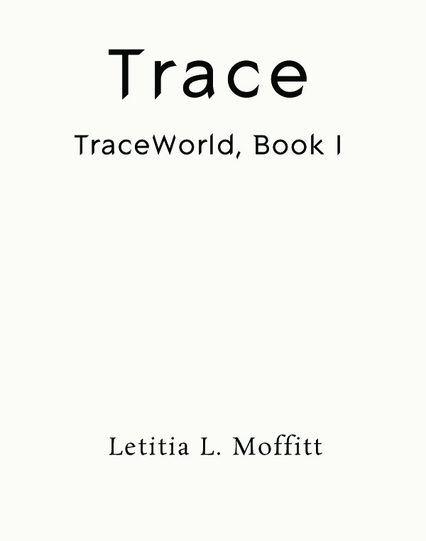
Months later, Cantraip Press, Ltd. (my corporate persona) contracted to publish Letitia L. Moffitt’s paranormal mystery, Trace. I did the interior of the print edition myself, using a purchased template, but Letitia disliked the font used in the headers and titles. “It would be fine for another novel,” she said, “but not this one.” She was right. I searched for an alternative and found . . . Crypton. It captures perfectly the edginess and razor wit of Trace.
Is that serendipity or what?


Leave a Reply
Want to join the discussion?Feel free to contribute!